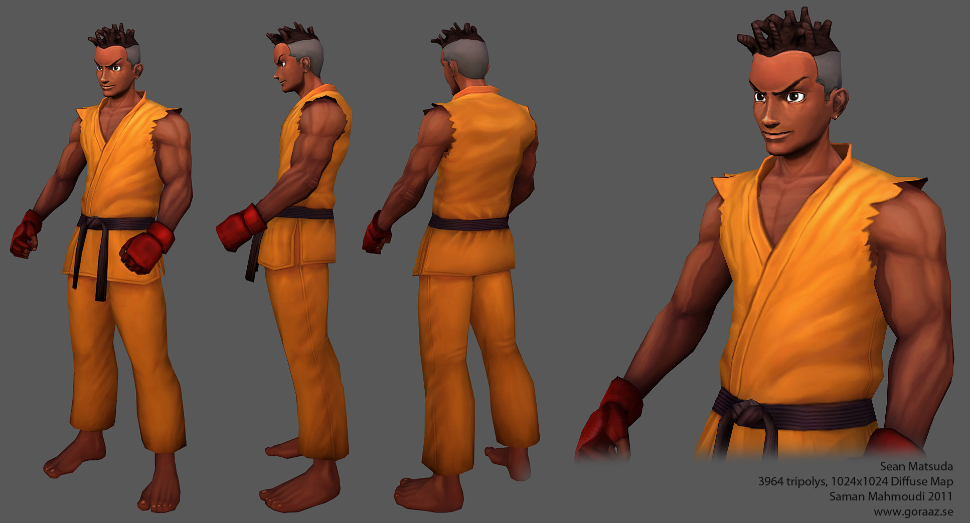
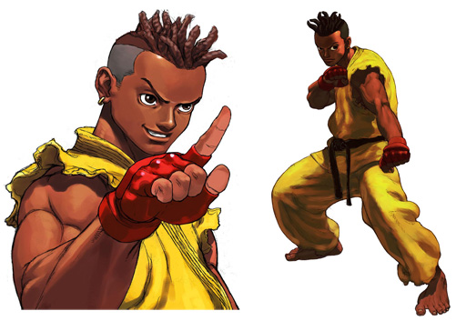
Welcome to my tutorial to hand-painting textures. The purpose of this tutorial to share my technique in painting hand-painting textures and the related stuff I've been learning since I started properly. The main difference between my approach to hand-painted textures and current-gen textures is that I like to make the character look like a painting. You have the light-source, shadows, focal point and more. I hope that this tutorial will if anything show you new methods that can be used when painting textures. I've been learning a lot since I first started and I figured that I would share this knowledge with people. I will be making Sean Matsuda, a character from Street Fighter 3. He has a simple but striking design so I figured that he would be a good fit for demonstration purposes.
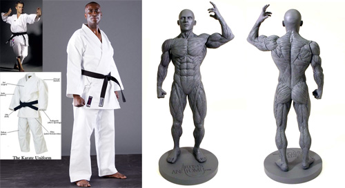
1. What I first do is look for useful reference material. I will not be limiting myself to concept art related to the the game but also real life photos of relevance. I will be needing photos of karate gi's and anatomy pictures of muscles. The character
may be anime'ish but in order to make him look more believable I recommend using more than paintings/drawings as reference material. Who knows, maybe the artist in question has made mistakes which will lead to you mislearning valuable information.
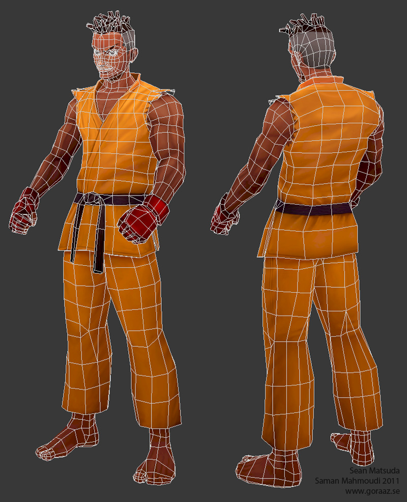
2. Let's get started. I won't go much into detail of the modeling in this tutorial because I want to focus on the texturing. What you see here is a pretty simple character model. No crazy details or anything, we will leave those for the textures. The sillouette should however pretty distinct and readable from a distance. We can exaggerate some of the different parts if necessary in order to achieve this. In this case we can use the gloves, hair, torn cloth pieces on the shoulder. An easy way to check the sillouette is by either using a pitch black material or by turning off the lighting in the scene entirely (no default light either).
It's important to plan ahead with the uv-mapping. For example, I know that his arms won't be looking different from each other so it's ok to overlap the uv's of those. Same goes for the head, except for the top part where the hair will be looking different on each side. It is very important to have unique shells of uv for the clothes in order to make it look more natural. Cloth folds never look the same on both sides.
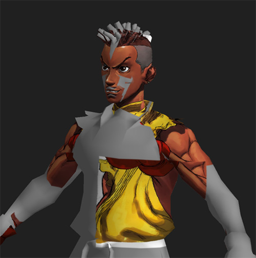
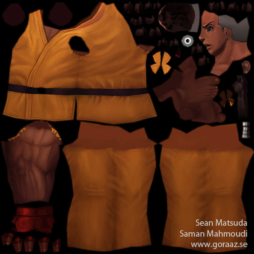
3. Next thing I do is to apply one of the concept images on top of the mesh using deep paint 3d(also possible with other programs like maya and photoshop). As you can see the model doesn't look much like the concept art. It's much easier to control a face's looks now that you can see the facial structure more properly with a texture, you can go back to the 3d program of your choice and change the mesh until it matches the look of the concept art. While at this stage you can look for uv errors to make sure they're are alright.
4. Next step is to get all the colors in, we make a rough color draft. Make sure the different color values are popping, this is very important. Keep it simple at this stage, avoid making the textures busy. You can zoom out of your model to see how well the different values work together. If they look the same all over then go back and paint more varying values. Another trick is to squint your eyes to see if you can tell the different colors from each other. If it's all just a big monotone sillouette then you're doing it wrong. What you also could do is to sketch in some of the details' contours like I've done with the muscles and some of the cloth folds. Not necessary at this stage though.
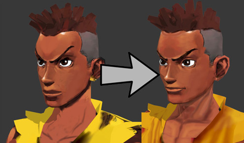
5. What I do next is shade the whole model, that is create a focal point with the rest of the model in a darker value so the viewer's attention will go to one place, the face in this case. The model will look less flat and it gets more pleasant to look at.
It's important to do this as early as possible(It is possible to add the shading later on by changing the darkness and saturation of all the different parts but that's just harder to do because of all the details that you will need to adjust, not to mention how the values will get messed up). A method I use is by adding two lights on both sides of the model and baking them into the texture. This way you will get something to start with and you can adjust the baked texture afterwards in order to get the shading right.
The feet and the hands should have the same value in shading but none of them should be pitch black. Keep them gray with the focal point entirely white.
6. Apply the new shaded light to your existing texture. As you can see the whole model looks less flat. Focus will be pointed to the face.
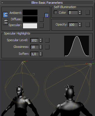
7. In order to get the lighting of the different hair-dreads right I baked another lighting. This helped me a lot because you will immediately get an understanding of how the light falls on the different dread strings. I used a black material with a high glossiness so the lighting would be more obvious to me.
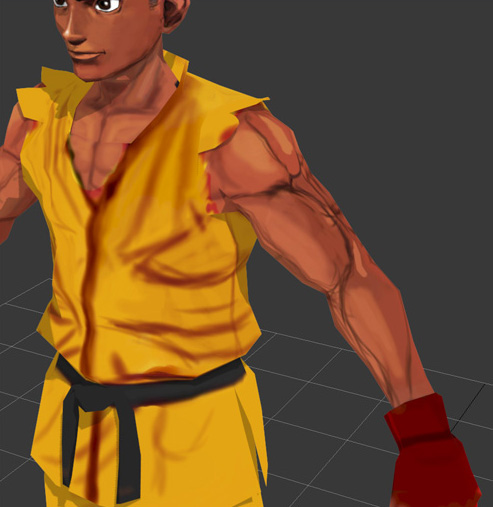
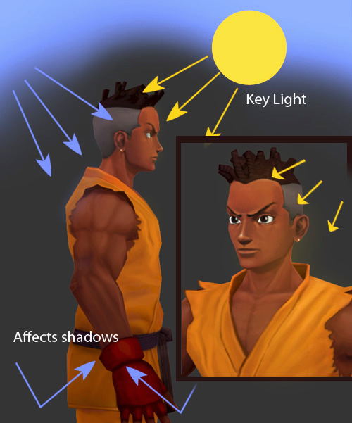
8. Now you can get on with the detailing. Make sure that you're painting according to the shading colors. Getting all the right values in is an essential part of the texturing process. You want the lighting to be right as well as the overall shading. The way I bring in the lighting is by using a key light from top-left of the character in a yellow-orange'ish value and a blue light coming from behind. Color bleeding from these two light sources will affect the shadows, they will most likely be in blue color because of the color of the sky.
The brightest parts should also be more saturated than the darker parts.
9. Always keep an eye on your reference material while painting. I'm guilty of just going off and painting whatever looks cool but in the end it will just look weird and you will have lost a lot of time by doing so.
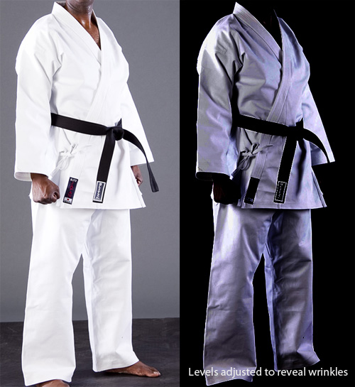
Karate gi's are usually very bright and the folds are subtle so it's a bit hard to tell how the cloth folds. I adjusted the levels of the picture in photoshop so I could see it better. Different sorts and amounts of folds suggest different materials of cloth, too many folds will result in the cloth looking very soft. Karate gi's are made of very thick material for an obvious reason so the folds should be very subtle.
Also look at different pictures of muscles and what not to be able to get the anatomy right. Again, make sure your values are popping. Zoom out now and then in order to see if your colors work well from a distance.
Make sure the details are consistent overall. Even if some areas are more flat and smooth, the brush strokes should still have the same size as the rest. However having too busy areas will result in the texture not being readable from a distance. It's good to exaggerate the size of some parts in order to increase the far distance readability as I've already explained with the
model sillouette earlier in this tutorial.
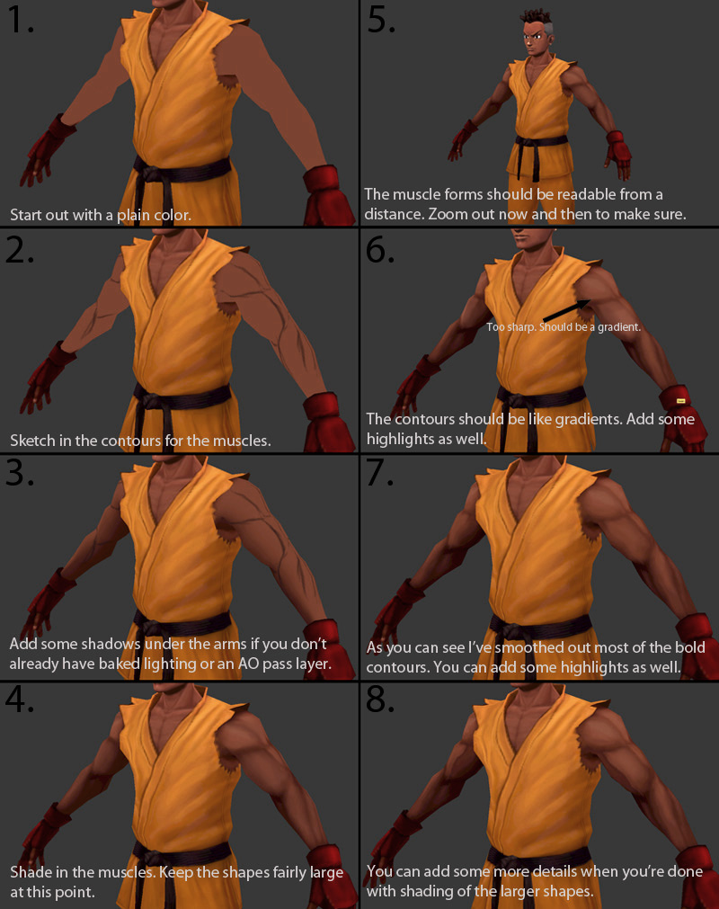
10. I put together a small workflow of how I paint muscles. The theory I've explained about shading the model goes here as well. Keep it simple and make sure the larger parts come out well first so they're easily readable. Then go on with the smaller details.
11. Try keeping the textures as clean as possible. By this I mean that the you should keep the gradients consistent (unless the material is supposed to look dirty). Pippet a color from a flat area and paint over the dirty parts with some transparency. Be careful not to remove the details though, you only want to clean the area.
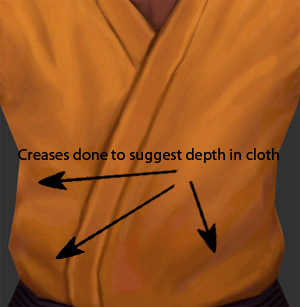
12. Keep the textures simple so you can keep control. The folds in the cloth should merge well together. They should also appear as if they have depth and not look too shallow. Make the folds look like they're actually there and not like paint on a surface.
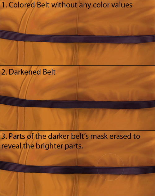
13. Here is a workflow of how I painted the lighting of the belt. I started by just having a simple value throughout the belt. I then copied the belt layer and darkened it(only the belt). After that I created a mask and removed the parts where the light should be hitting. You get a nice gradient like this. Use a large eraser brush with some opacity when erasing the mask.
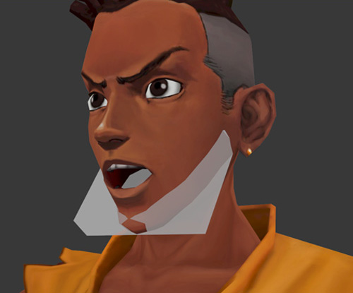
14. The texturing of inside the mouth is a little bit tricky. You can paint it by either using morph targets/blendshapes or by just rigging a bone to the jaw and animating it. I do this because I want to be able to see the character with an open mouth without having to change the mesh entirely.
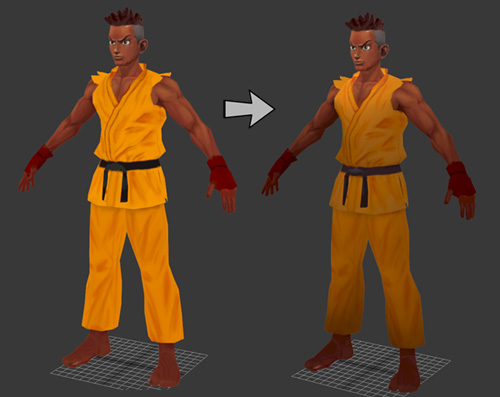
15. And that's it. You may have noticed that my model didn't turn out exactly as the concept. My intention was to make a model that would work in a game engine so I had to do some changes/sacrifices in order to achieve that. Some things were changed because of my own opinion in taste. I for instance figured that a cloth material used in real karate gi's would be a better fit both in order to make him more beliavable and because it fits the rigid nature of lowpoly models better. The color of his skin(mainly the face) was brightened up because of the focal point lighting and the color of the gi was changed to a more red/orange yellow to compliment the brown/blue color of his skin better.
Also notice how I've changed the model gradually while I've progressed. I've changed the size of his head and done a few small adjustments to make him look more buff and older(he looks very young at my initial modeling). As long as you don't do any major changes to the model you won't have any difficulties with the uv. Keep the changes small though.
I hope this tutorial has been helpful and I'd like to thank you for reading. =)
All artwork (c) Saman Mahmoudi unless stated otherwise.
Sean Matsuda is property of Capcom. saman.mahmoudi@gmail.com