Here I've written my workflow for the Dog Archer character. Some people were interested in knowing how I made this model so I figured that I would throw together a little description of the different steps I took. My painting technique is pretty straight forward, I use photoshop and Deep Paint 3d and stick to the standard brushes. Nothing special there really. It's pretty much like painting a 2d painting. You paint in all the different hues based on lightsources and what not.
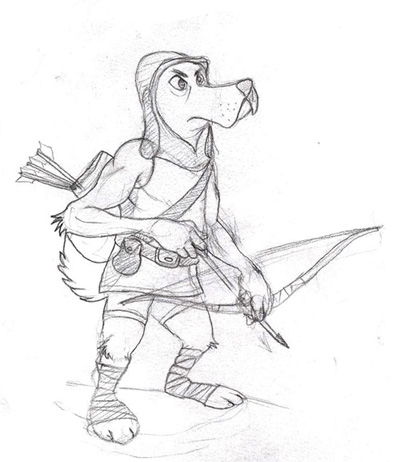
I started out with an initial sketch, of course. It's important to have a clear view of what the character is gonna look like
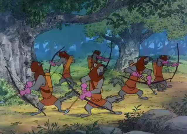
so you can plan ahead. I already had a somewhat shallow view of how the character should be but I wasn't entirely sure. What I knew was that the character was to resemble the bowmen from Disney's Robin Hood but that I needed to push the design further to make him look more like a special character than just a common grunt.
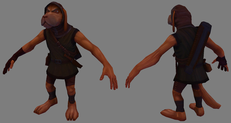
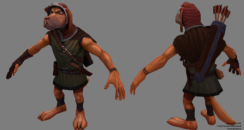
The modelling was pretty straight forward. I tried to maintain a good sillouette and shape with correct anatomy and proportions. I put the polygons where they would affect the anatomy and sillouette the most(anatomy is essential even if it's a cartoony character). Using references for
clothes(folds especially) will help you a lot as well. This may be a cartoony character but using photos is still prefered rather than using painted reference material since even very good artists can make mistakes. This is a way to be on the safe side.
I changed and improved the character design as I went on. This can cause problems because you don't want to go back to redoing a uv-map that's already been textured on. You may have seen that there are a few empty spaces in my uv-set and that's a result of this problem. This can however be solved, to some extent, by baking the original model's diffuse on a new one with better uv maps. But yeah, live and learn I guess.
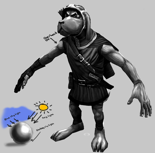
I started the texturing by painting out the initial value colors. This is very important as you want to have the values ready as early as possible before starting with the detailing. You can however go back to photoshop and fix the values of a certain part but that might mess up the details so I advice against that. There could also be bad uv's on the model which you may have missed so fixing smaller errors at this phase is good, you want to do this as early as possible. As you can see on the first iteration of my model down below, the colors and some details are set but their values are too close to each other. You want the different parts' colors to "pop" so you can see the distinguish the different limbs and parts of the clothing(you can squint your eyes to see if the colors are popping or not).
The screenshot above is shaded to an extent but you want to push it even further. You want the whole model to feel as one single object instead of a bunch of unrelated limbs attached to eachother. For this you need to use the same shading and light-sources for the whole model. Older engines couldn't handle dynamic lights very well thus making the 3d models look very flat. Painting in the lights and shadows in the model is a good compensation.
I usually have the key light-source, resembling the sun, come from a front-upper-right angle. The key-light is usually yellow-orange colored so the brighter parts in the textures are slightly mixed with this value.
The light-source coming from behind is slightly blue, resembling the color from the sky. The shadows are usually also blue because of the color-bleeding
from the sky, bouncing from the ground(especially the ones on the back). Characters aren't always outside in a sunny environment but it's better to stick to a lighting you know the character will be presented in the most.
I played around with the colors and desaturated a screenshot(below) to demonstrate this better. Notice how the parts where the key-light hits directly are brighter than the rest. (I used overlapping
textures on the arms and the legs which explains why the value on both sides are the same!).
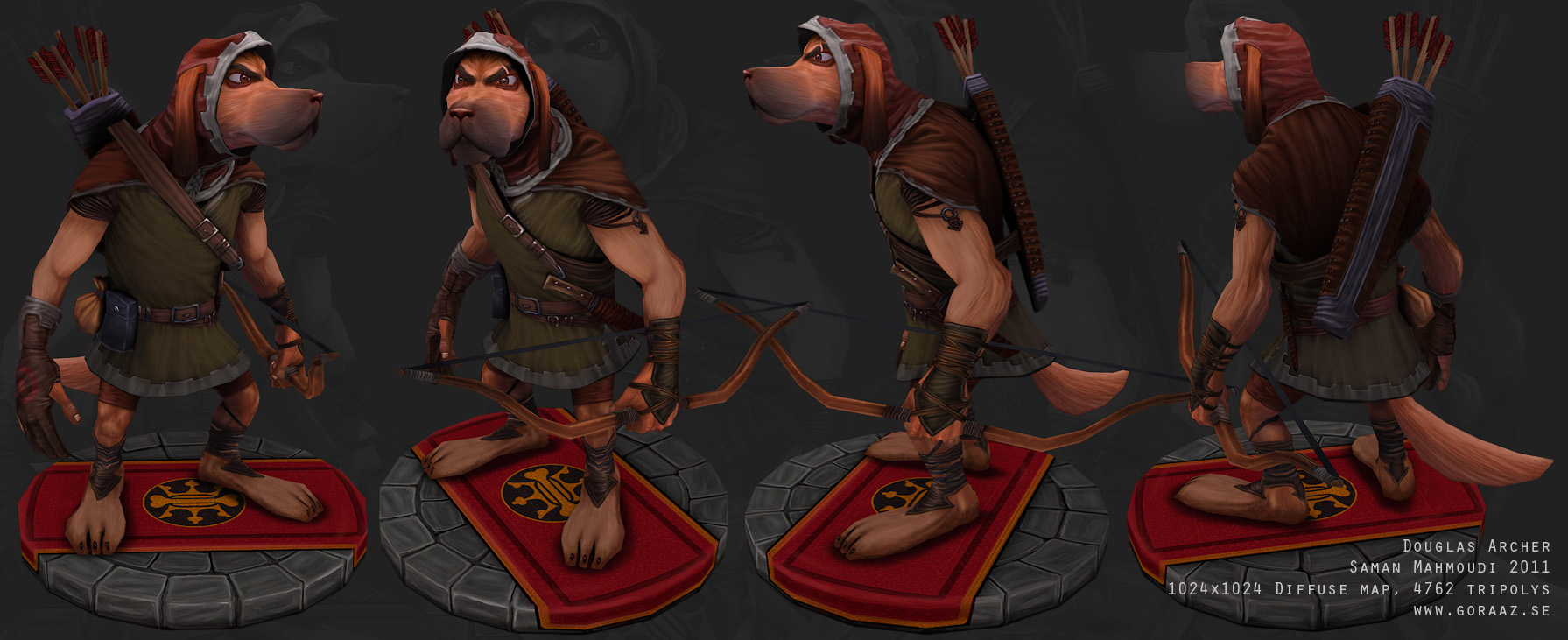
The style of which I was going for was a World of warcraft'ish style with a bit of Disney. WOW's style isn't much about detail effects but more vivid colors and/or lighting. Having too much details can go both ways, there is a big risk that the textures will look too busy and lose the main shapes. An easy way of testing this is by zooming out every now and then and/or squinting your eyes to see if the overall shape remains.
The entire model should however have the same amount of details. You want the whole texture to have the same brush size to prevent inconsistencies. The back for instance shouldn't be as conspicuous as the front but equally detailed. Never try and hide parts by painting with
really dark shadows either.
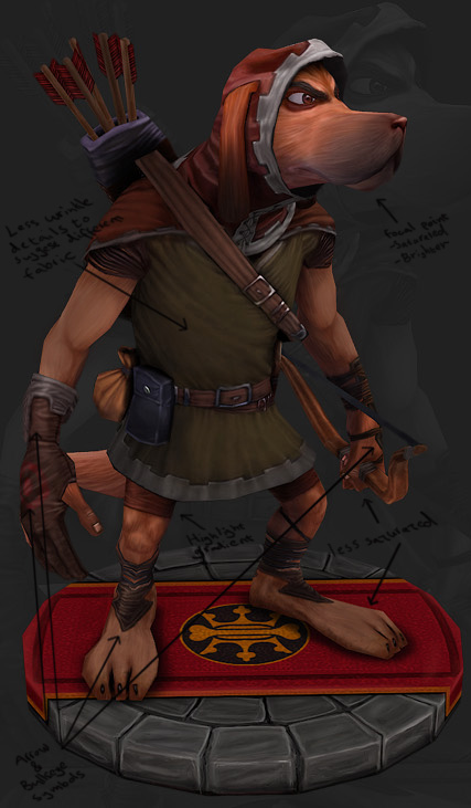
Eyal 'Shotgun' Shoham had some really good advice regarding the design among other things. What shotgun told me was that it's important to use symbols and shapes that would fit the character
well, in this case the arrow symbol since the dog is an archer. It's good to stick to as few shapes and symbols as possible so that you don't confuse the viewer.
I added some other parts to the character such as the cape and a scar to give him
more character. I also scaled the legs down and made his torso longer to match the original disney bowmen better.
The highlights in the texture are very important. Nice highlights with gradients are like eye-candy, therefore it's good to add it everywhere.
The brightest parts should also be more saturated with the darker parts less saturated. More saturated and bright= more focused, interesting. Don't overdo it though ;)
I finally added a focal point on the character, the face in this case. You want the viewer's focus to be on a certain part of the character. Having the
face be brighter and more saturated grabs the viewer's attention. Having hands and feet be darker can help it even further(the parts furthest away from the
focal point).
The rig I made is a simple biped rig made in 3ds max. I didn't make any morph targets for the facial expressions, instead I used boxes to control the different parts of the face. I used the same technique for the ears as well. Ponytail was used for the jaw.
The two things you should to bear in mind is that; 1. Mirroring can cause problems so try not to use it at all. Some engines have problems with this.
2. It's also good to reset the scale of each box before parenting them to prevent size issues(the objects can get deformed in a weird way because faulty sizes will add to the next object in the parent chain).
Edit: I have since I've made this workflow tutorial started using Xtras biped bones instead of creating boxes. It works much better and it's much easier to use so I recommend using that instead.
And that's it.
I hope this workflow has been helpful. I figured that I would write down and share all of the stuff I've been learning from feedback of other artists, mainly shotgun and haikai(big thanks to them btw). Posting your art on forums is something I very much recommend, show a friendly attitude and people will most likely help you out. =)
If you have any questions just throw me a mail. Thanks for reading!